
In today’s digital landscape, mobile devices account for a significant portion of internet traffic. As more users turn to their smartphones and tablets to browse the web, ensuring your website is mobile-friendly has never been more crucial. Not only does a mobile-friendly design improve the user experience, but it also plays a pivotal role in search engine optimization (SEO). In this blog, we’ll explore why mobile-friendly websites are essential for both SEO and user experience, and how optimizing your website for mobile devices can lead to increased traffic, better rankings, and higher conversions.
1. Mobile Traffic is Dominating the Web
Why It’s Important:
Mobile traffic has surpassed desktop traffic in recent years. According to Statista, more than 50% of global web traffic now comes from mobile devices, and this trend is only expected to continue. If your website isn’t optimized for mobile users, you’re potentially alienating a large portion of your audience.
What It Means for SEO:
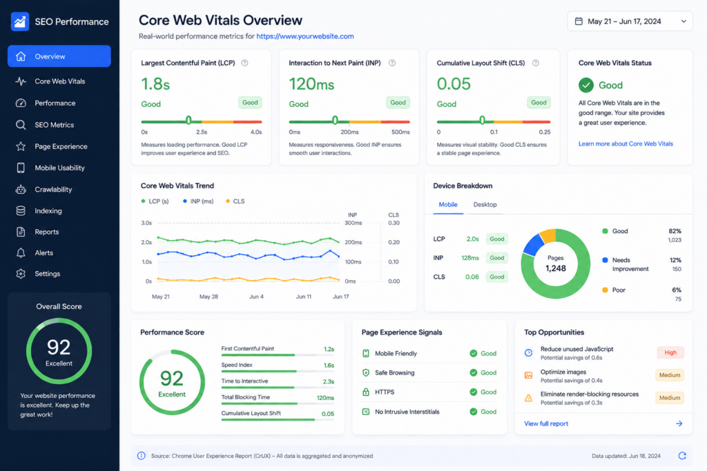
Search engines like Google prioritize mobile-friendly websites, especially with their mobile-first indexing policy. This means Google predominantly uses the mobile version of a website for ranking and indexing, rather than the desktop version. A non-mobile-friendly site could negatively affect your rankings, even if your desktop site is optimized.
Pro Tip:
If you’re not sure whether your website is mobile-friendly, use Google’s Mobile-Friendly Test tool to see how it performs on mobile devices.
2. Improved User Experience (UX)
Why It’s Important:
Mobile-friendly websites ensure that visitors have a smooth and pleasant experience when browsing your site on their smartphones or tablets. A mobile-friendly design typically involves responsive design, meaning the site automatically adjusts its layout to fit the screen size of any device.
What It Means for SEO:
A positive user experience directly impacts SEO. If users find your website easy to navigate and enjoyable to use, they are more likely to stay longer, explore more pages, and convert into customers. High bounce rates and low engagement signals to search engines that your site may not be providing a good experience, which can harm your rankings.
Pro Tip:
Ensure that key elements such as navigation, forms, and buttons are easily accessible and functional on mobile devices. Avoid intrusive pop-ups that may frustrate mobile users.
3. Faster Load Times for Better SEO
Why It’s Important:
Mobile users expect fast-loading websites. With limited bandwidth and slower internet connections, websites that take too long to load on mobile devices can quickly lead to frustration and abandonment. According to Google, a delay of just one second in page load time can reduce conversions by 7%.
What It Means for SEO:
Google factors page speed into its rankings, especially for mobile searches. Websites that load quickly are favored by search engines, while slow websites can experience a drop in rankings. Optimizing your website for speed not only improves user experience but also boosts SEO performance.
Pro Tip:
To improve mobile page speed, compress images, minify CSS and JavaScript files, and use a content delivery network (CDN) to reduce server response times.
4. Mobile-Friendly Websites Increase Conversions
Why It’s Important:
A website that’s easy to navigate on a mobile device helps guide users to take the desired actions, whether that’s making a purchase, filling out a contact form, or subscribing to a newsletter. A seamless mobile experience is crucial for converting visitors into customers.
What It Means for SEO:
Conversion rate optimization is an important part of SEO. Websites that effectively convert visitors into leads or customers are seen as more valuable by search engines. When your mobile site is optimized to encourage conversions, not only will you increase sales, but your SEO rankings will likely improve as well.
Pro Tip:
Make sure your mobile site has clear calls to action (CTAs), easy-to-use forms, and an intuitive checkout process for e-commerce sites.
5. Google’s Mobile-First Indexing
Why It’s Important:
Google’s mobile-first indexing means that Google predominantly uses the mobile version of a website for ranking and indexing. If your website isn’t mobile-friendly, your search engine rankings may suffer. Google’s goal is to provide the best possible results for users, and since most searches are done on mobile devices, Google prioritizes mobile-optimized content.
What It Means for SEO:
If your site is not optimized for mobile, you may miss out on valuable SEO opportunities. Google rewards websites that provide a seamless mobile experience with better rankings, while sites that are not mobile-friendly may see their search visibility drop.
Pro Tip:
Use responsive design to ensure your website adapts to different screen sizes. This will help ensure both mobile and desktop users receive the best experience and improve your site’s chances of ranking well.
6. Lower Bounce Rates and Increased Engagement
Why It’s Important:
A mobile-friendly website encourages users to stay on your site longer and explore multiple pages. If your site isn’t mobile-friendly, users may bounce (leave your site quickly) because it’s difficult to navigate or view content. High bounce rates are a negative signal to search engines and can harm your rankings.
What It Means for SEO:
When users stay longer on your site, engage with your content, and visit multiple pages, it sends positive signals to search engines. Search engines interpret this as high-quality content that satisfies user intent, which can improve your rankings.
Pro Tip:
Optimize your mobile site to ensure all content is easy to read, and navigation is intuitive. This will encourage users to stay on your site longer and explore more pages.
Conclusion
A mobile-friendly website is no longer optional—it’s a necessity. With the increasing prevalence of mobile device usage, optimizing your website for mobile is crucial for providing a positive user experience and ensuring strong SEO performance. From improving page speed and lowering bounce rates to boosting conversions and improving rankings, mobile optimization plays a pivotal role in your website’s success.
If your website isn’t mobile-friendly yet, it’s time to make the necessary adjustments to ensure your users—and search engines—get the best possible experience.
